Monday, April 6, 2015 at 6:00 pm to 7:45 pm
Chi-hui Yang, Film Curator
Abstract: In this session, Yang will discuss his work as a curator of film and video, in particular, what it means to curate and what the political and creative aspects of this act are. What kind of public interventions can be made in the presentation and contextualization of creative works? How are information and art assembled and organized to create new meanings? What is the function of a curator as an idea connector in today’s art and media economies, and how might one explore this practice?
JOE INZERILLO: “MATHEMATICAL INTERPLAY OF ACCELERATED BODIES; OR, HOW I LEARNED NOT TO SLIDE INTO FIRST BASE”
Ashley George Maritere Berrios Pizarro Kaylie Schneider
On March 16, 2014, Joe Inzerillo, Executive Vice President and Chief Technology Officer at MLB Advanced Media (MLBAM), gave a fascinating lecture, as part of the School of Media Studies’ lecture series, on technology and baseball, as well as his organization’s developments in live streaming and Internet technology.

Source: pmcdeadline
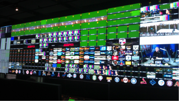
Baseball has a long history of integrating innovative technologies both on and off the field. Thomas Edison chronicled one of the first games at the onset of film in 1898. Even the field environment itself, seemingly the most “analog” of environments, has improved with the advancement of architecture and technology. A few notable examples include Philadelphia’s steel and concrete Shibe Park construction in 1909, the first three-tier structure development at Yankee Park in 1923, Fenway Park’s introduction of lights in 1933 (with night baseball launching at Crosley Park a few years later in 1935), and the Astrodome equipped with air conditioning in New Orleans in 1965. And over the years the live action on that field has been “augmented” with scoreboards, statistical displays and screens for instant replays. Film, photography and motion graphics have transformed the way we mediate baseball for remote viewing. MLBAM represents the next step in our technological “augmentation” of baseball, and is now engaging in a high level transformation of how baseball’s fanbase interacts with the sport through interactive design, social media apps, and powerful streaming capabilities.
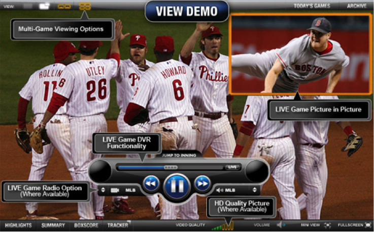
Acknowledging the dramatic and fast-paced evolution of recent live streaming technologies, pay TV, and new options for “bundling” programming, Inzerillo stressed that this proliferation of options will “enlarge the pie, as opposed to stealing other people’s slices.” Everyone wins, he suggests: MLB, other companies, and most of all, the consumer — and these options provide robust opportunities for MLBAM to engage and partner with other companies and industries. The MLB’s partnerships and consumer feedback continue to allow customers the ability to be specific about what they want and to choose what they deem valuable. This brings into question how this new technology might advance the “cord cutting” revolution — that is, the rejection of traditional cable service. MLBAM has not only set a trend with their emphasis on cord cutting, but its business model enables content providers to engage in OTT (Over-the-Top) online functions. With OTT and online functions becoming readily available and status quo, these services could lead to a drastic change in bundling and the pay TV model consumers know today.
Source: ballparksonabudget
However, with innovations and customizable content readily available in apps, online, and even in person, one must consider the idea that data can reach a saturation point. The question of oversaturation is worthy of further analysis as technology continues to multiple the means by which we can access mediated content. Inzerillo acknowledged that both as consumers and content providers, we do risk an overload. As a consequence, he says that “we need to make computers work harder for us” with contextual and accurate content — that is, content that provides a framing story for the game, along with useful statistics. By presenting relevant statistics and information, MLBAM strives to make content that is both “elegant and functional”. When considering integrating a new feature or service, Inzerillo says he and his team ask themselves: Is this something that is vital to MLB consumers? Inzerillo was the first to point out that these innovations appeal largely to a younger demographic of baseball fans. In spite of this, the MLB aims to “ride the middle” by enabling additional options of content consumption (both online and in-person) without altering the conditions of the game. Younger generations of fans are looking to consume the game differently, so more information is produced in the form of apps, integrated technology in the ballpark and increased access to statistics. Older generations may not be as accepting of the advancements in technology, which has encouraged MLB to leave the physical game (the player and the baseball itself) unaltered by technology for the time being. Considering the divide between baseball’s traditional and modern fan bases, the question remains as to whether or not these technological advancements increase the risk of overshadowing the game itself. Is the excess of technology in sports truly necessary or has it become cultural pandering?
Source: gawkerassets.com
The possibility of excess aside, these technological advancements do breed positive opinion amongst the modern baseball fan base. While baseball has historically been primarily a “human” sport, it now exists within a specialized environment (the ball field/baseball diamond) that is capable of adapting to the progression of technology — as are the fans themselves. As Inzerillo pointed out during his presentation, there is a vast future in measuring, mediating, and augmenting the ball field to provide a technically rich baseball experience for athletes, coaches, fans of all ages. Player and Ball Tracking via Statcast and PitchFX, pacing the game through high visibility clocks, camera synchronization for instant replay and MLB’s large video infrastructure and network are a few of the technologies the organization has rolled out in the past decade. It’s clear that these impressive developments allow for wider accessibility to the game and the sport in general, as the fan can engage with players and the field in what may translate as a more intimate user experience, or for some fans — particularly those of older generations — a more alienating experience. MLB is both heightening the user experience for the newer generation of baseball fans, while also fracturing the authenticity of the game for the older generations that have less interest in integrating technology into their lives.
A deeper look into baseball’s technology and human elements undoubtedly reveals an interesting relationship between the two and the future advancement of man and machine on the field. In addition to the question of the necessity of technological excess in baseball, another question one might ask is exactly how far can we go with technology on the ball field? Based on the high level of capture technology that MLBAM has access to, the use of multi-camera approach allows an opportunity to document plays on the field in a manner that exceeds the perceptual capabilities of a human on the field. The human umpire is currently the officiator of the game who holds the power of making calls based on his observations. It doesn’t seem out of the question to increase dependence on the camera’s documentation method when making calls and eventually replacing the human officiator with a purely technological device with a lower probability of error. While the camera technology’s documentation can be distorted by technical malfunctions and operator error, there is an element of objective truth in a recorded image that can be viewed and verified by many that that is incomparable to human observation.
When asked about the probability of error with the human umpire, Inzerillo emphasized the high level of training that both umpires and players engage in throughout their careers in major league baseball. He offered MLB’s focus on modern kinesiology, physical training and nutrition as major factors in building more powerful athletes and umpires who have quick reaction time, stamina and clarity of mind. Video coaching is one feedback component that is used with coaches, players and umpires to track habits and analyze opportunities for improvement. MLB considers both their players and umpires to be both physically and mentally elite. They are acutely aware of the need for quick, efficient response, which leads them to continuously focus on improving mind and body of all involved on the field. Video coaching and MLB’s technologies can aid in these training efforts. This marriage of technological and biological optimization ostensibly produced the ideal athlete — one less prone to human error. This kind of bio-technical training and management has implications for other industries, as well. While these developments might lead to increased human potential, they also run the risk of proving exploitative, raising a host of bio-ethical and political-economic concerns. Time will tell whether or not continued advancement and saturation will positively or negatively impact not only baseball, but the way we relate to and communicate with one another in all arenas.

Source: espncdn.com
In this cultural landscape largely mediated by digital technology, consumers come across a much wider array of signs, symbols, codes, annotations, etc. With such augmented modes of interaction (such as the previously mentioned apps and interactive field features), this new digital landscape can be considered a form of hyperreality for some consumers. Hyperreality, as Umberto Eco defines it, means the subsumption of the “original” and authentic work to its enhanced, richer “copy”. For our purposes, the mediated MLB experience possibly feels more “real” to the younger generation — those who grew up with satellite, surveillance imagery, and selfies — because they can more closely interact with it. An example of how baseball provides recent generations a more “real experience” by their standards includes the opportunity of making more direct judgment calls while using various viewing tools and apps versus. In “From Work to Text”, semiotician Roland Barthes defines the piece of work as closed, fixed, complete, easily categorized and meant for absent-minded consumption, and the text, in contrast, as open beyond itself, incomplete, intertextual, resisting categorization, and fostering multiple interpretations. With so many modalities through which to engage with the game, and so many layered data streams “enhancing” that game, the live and mediated baseball experience are both power cultural texts that grant audience members tremendous agency in giving them shape.

Source: theatlantic.com
Even as baseball and other historied pastimes become more and more “mediated,” the sport will indeed continue to be a strong, relevant experience because of its rich history. Among the more fascinating aspects of Joe’s presentation were not only his individual passion for the game but also his emphasis on “trying to tell the narrative of baseball” through technology. It’s not all about using this technology to create flashy boards and analytical data that drive their business; the MLB is interested in furthering the historical narrative of baseball. It’s clear that this game is deeply embedded in American culture. Now that we are moving quickly towards a chiefly digital universe, baseball must also incorporate these elements to stay up to speed and in sync with the modern narrative of our lives. It’s no surprise that baseball has jumped on the technological bandwagon, and the work they are doing at MLBAM is remarkable. However, we must remain critical aware of how this mediation impacts the physical game both positively and negatively,and how technology and people work together in shaping the distinctive time-space experience of our favorite pastime.
Jeanne Liotta An Experimental Filmmaker

Figure 1
Alexis Pittman Humberto Gomez Mohamed Abo el Wafa Samah Abaza
Introduction:
“Each person has the responsibility or opportunity as a human being to discover what their world is made of and what they think about it – to observe and take notes and reflect upon — that’s our jobs as human beings somehow, that’s what I feel like I’m doing when I make things. It’s just my thinking, the real world at last becomes a myth.” -Jeanne Liotta
On March 2, 2015, multimedia filmmaker Jeanne Liotta presented a lecture entitled “The Real World At Last Becomes a Myth: Ruminations on Art and Science.” The title, she explained, was a reference to How the true world became fiction? from the Twilight of the Idols by Friedrich Nietzsche—and in her lecture she examined how media-making shapes our perception of the “real,” empirical world.
This paper is a reflective response to Liotta’s lecture. It explores three main elements:
1. Liotta’s concept of integrating art with science and our perception as “sample audience” to her approach of communicating complex science matter through film. 2. The aesthetics of Liotta’s work and what we got out of it as non-science oriented audience. 3. Liotta’s best work and her awards in the genre of experimental film.
The paper will then conclude with collective insights on some of Liotta’s work as successful examples of experimental films.
The Fusion of Art and Science
When we looked at Liotta’s work prior to the lecture, we weren’t quite sure how to “read” it, or how to understand the means by which it was made. Her lecture, however, provided helpful context regarding her methods, which helped us understand her technique and appreciate the aesthetics of her work. Liotta, who regards her work as a fusion of science and filmmaking, made several references to her love of the stars and the cosmos. Given the widespread fascination with astronomy, we weren’t surprised to find that the audience seemed enamored with this work.
The focus within the majority of her works is on this intersection of art and science. Her most recent body of work, The Science Project, encompasses a constellation of mediums that present an intersection of art, science, and natural philosophy. Her longest project Observando el cielo, from 2007, examines our relationship with space, using seven years’ worth of night-time recordings of the sky. Some viewers, seeing the “natural” imagery in Liotta’s work, might approach it as scientific documentary—and might then be frustrated with her lack of a clear, didactic message. Yet even for those for whom the “message” is unclear, the aesthetic value of the work is apparent: one can’t help but appreciate the beauty of her layered imagery and the nuanced composition of each shot.
Liotta’s Work: Aesthetics & Value
Aesthetics refers to principles governing the nature and appreciation of beauty. Liotta’s appreciation for the aesthetics of science—and her dedication to capturing those aesthetics in her own work, often through several-year-long research and production processes—shone through in her presentation. When we asked her about the challenges of producing such complex imagery, she said: “I believe my job as an artist is to create something that makes people feel more connected to the universe.” Her signature film Observando El Cielo was completed in seven years, Crosswalk took eight years, and her most recent project, Soon, was completed in one year to mention a few.
Liotta experiments even with the “science,” the physics and chemistry, of the image itself—even her own images. For example, “Loretta” was a piece of work she had produced using a “cameraless” process. She explains how she produced a photograph by placing a 35mm negative on top of raw 16 mm stock and then exposed it frame by frame with a flashlight—a process known to experimental filmmakers as a “photogram.” She reminds us that artists will always push their methods beyond what any sophisticated camera can offer—and it’s in this human extension of the machine that we find the most innovative and captivating work.
Another great example we found was Hephaestus of the Air Shaft. Through the course of this film she uses an assortment of shots, all from the same position.
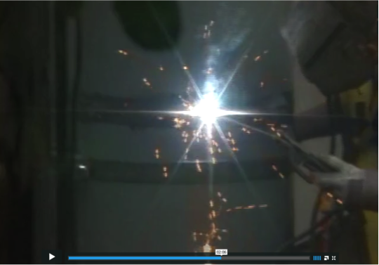 She opens the film with a blank screen and a buzzing noise, then transitions into a wide shot out a window, where a man hanging on a chair in the adjacent building is doing what looks like some metal work. The next shot is a medium shot where you see the metal worker measuring the wall; she then zooms out to reveal the location of the shot. At one point, the focus goes from the metal worker to the welding tool causing the spark, which looks much like a star. Given Liotta’s fascination with stars, one could claim that maybe on some level she was experimenting with different optics and was trying to find celestial events in human labor on earth. The use of light and shadow, framing and composition—including the framing of some shots with household plants, which created a sense of enclosure — along with a mix of grating machinic sounds and ambient music, created a simultaneously mythic and quotidian feel. Such an feeling is only appropriate for our Hephaestus, the “blacksmith of the gods,” in a mundane airshaft—a myth brought down to earth.
Liotta’s Best Works:
Over the previous 10 years, science and astronomy have been subjects in most of Liotta’s work. Observando El Cielo, a film that resulted in seven years of recording the cosmos, won the 2008 Tiger Award for Short Films at Rotterdam. It was acknowledged as one of the best in the decade by The Film Society of Lincoln Center.
Another significant piece of work that displayed Liotta’s range as a filmmaker is the critically acclaimed Crosswalk. In this particular work, she stepped out of the realm of science into the spiritual to film a series of Catholic processions that took place on several consecutive Good Fridays. She captured and documented various people for eight years as they took to the streets on the Lower East Side for the Easter celebration. This film adopted a new scientific lens – that of the anthropologist observing the rhythms and traditions of a culture progressing over time.
Liotta’s experimental uses of slide projections, rayograms, and other unique techniques of image creation can vary from one piece to the other. However, her work process seems to have a consistent element throughout—that is, the timeframe she sets or takes to complete her pieces. Her process alone makes her a scientist herself—one who uses film as a medium for her experiments. She observes her world – whether natural occurrences or human behaviors – and she gives each project one a sufficient amount of time, allowing her ideas to develop.
This is Liotta’s process, her “science.” No shot, piece of sound, color choice or transition ever goes to waste, because in the end they all have a purpose and function in communicating their message while producing aesthetically pleasing work. Liotta’s lecture was, for us, an eye opener: it revealed how the medium of experimental film affords a massive range of techniques to simply express a thought or tell a story.
Conclusion:
While, given the scientific subject matter of her work and her experimental process, we might characterize her work itself as a science. On the other hand, Liotta’s work can also be characterized as “abstract art.” Her films can be regarded as abstract audio-visual assemblies that were collected over a long period of time. Even if the “results” of her scientific method are inconclusive, the aesthetic value of her work is undeniable: one can’t help but appreciate the beauty and distinct composition of her imagery, as well as her commitment to such long-term productions.
We leave you with a question Liotta posed in her lecture that is: “What is considered art?” Is it about the process of the artist and the aesthetics of his/her work? Or can it be considered a multidimensional and a subjective field where the work is an invitation for the viewer to connect in one way or the other to the artist’s world?
References:
[1] Smith, S. The enlightenment of Jeanne Liotta. Citizen Science. 02.17.2012.
Retrieved from http://www.austinchronicle.com/screens/2012-02-17/citizen-science/
[2] Land, R.W. (2006). Little Paintings. MFA thesis submitted to the Department of Photography and Film, School of Arts,. Virginia Commonwealth University. P.9
Image retrieved from http://www.jeanneliotta.net/filmpages/loretta.html
Websites:
http://www.jeanneliotta.net/filmpages/loretta.html https://vimeo.com/26745200

Monday, April 13, 2015 at 6:00 pm to 7:45 pm
Melissa Gregg, Principal Engineer, Intel Corporation:
Abstract: The rise of personal productivity systems reflects the consumer-enterprise collision underway as work escapes the confines of place to be more flexible, pliant, and ambient.
Mallory Brennan Andrea Tuccillo
Intro:
In Laura Kurgan’s talk “Seeing Through Data,” she presented her work as research that engages with the world. Kurgan and her team at Columbia University’s Spatial Information Design Lab seek to harness the seemingly endless flow of information and data—from satellite images to social media posts—and, through the use of design and mapping techniques, convert it into easy-to-comprehend visual formats. Their hope is to spark discovery, action, and, in some cases, significant change.
Kurgan detailed her work on several projects, including:

Million Dollar Blocks, arguably the lab’s most well-known project, which looks at the home addresses of incarcerated people to determine which areas have the highest concentration of convicted criminals and how much money it costs to incarcerate them.
Conflict Urbanism: The Aleppo Project, an in-progress examination of the effects of the ongoing Syrian civil war on the city of Aleppo and its surrounding villages.
Jumping the Great Firewall, which studies how users of Sino Weibo, the Chinese version of Twitter, creatively evade China’s strict censorship laws.
Port to Port, which maps energy shipping routes around the world over a ten-year period and presents the changing patterns of oil transportation.
Native Land, a panorama presentation that shows how people move around the world for economic, political and environmental reasons – as well as the effects of their migrations.
Each project connects data in a different, socially-engaging way. Some, like Native Land, were created simply to convey ideas and information. While others, like Million Dollar Blocks, were intended to serve as a call to action.
Our response to data is colored by the way it’s presented to us, but it’s also influenced by our respective backgrounds. A graphic designer might focus more on the layout and the colors used in the visualization, whereas a journalist might focus more on the story it’s telling. In looking at Kurgan’s talk through the filters of our different experiences – where we’re from, what we’ve studied, what we do for a living – we each realized how SIDL’s research not only engages with the world on a broad scale, but how the research can engage with the individual on a personal level, as well.
Using Mapbox, one of the mapping interfaces Kurgan spoke about in her presentation, we decided to map ourselves. We placed points on the map denoting a key marker on our respective journeys: our college education. It’s where we began our studies in graphic design (Mallory at Parsons The New School for Design) and journalism (Andrea at St. John’s University) – two subject matters that play an integral part in Kurgan’s work, and also serve as the foundation for our individual responses to her talk.
Our individual responses, which you’ll find posted to the map, are also reprinted below:
Andrea’s response
Data: Embrace with Caution. The age of data enthusiasm is upon us, and while Laura Kurgan fully immerses herself in this world, she knows it requires a healthy dose of questioning. She acknowledged this approach—enthusiasm mixed with suspicion—in her talk, and it’s a mindset that instantly appealed to my journalism background.
Journalists are always collecting facts and figures, and trying to find the story among seemingly disparate parts. They’re constantly questioning to get at the truth; constantly striving to make the invisible, visible. While a journalist’s way of telling a story or revealing a truth might be different from Kurgan’s in execution, the research process can be much the same. In fact, the worlds of journalism and data visualization frequently collide.
A particular example of this crossover is the Jumping the Great Firewall project, which highlighted the censorship of the Chinese regime and the creative efforts of Sino Weibo users to circumvent it. The users of this social medium realized that images are much more difficult for automated censors to analyze, so they’ve taken to posting pictures of text to get their messages across.

The SIDL collaborated with the online investigative data journalist team at ProPublica. Together, the two teams translated 500 images in a two-week sample to categorize the most contentious topics. They were able to break down those topics into 10 general categories, with “political speech” being the largest category of censored images. This category encompasses any post that criticizes the Chinese government, questions historical events or calls out injustices.
When the initial project was complete, an ironic discovery was made. The effects of censorship went far beyond simply deleting information. The censorship itself became a source of information. By shedding light where the Chinese government intended there to be darkness, this project was able to show the resilience and resourcefulness of the Chinese people—a quiet force in the face of oppression.
The SIDL’s Port to Port project also featured close collaboration with a news organization. Kurgan’s team used data assembled by Thomson Reuters to plot global oil shipping routes on an easy-to-navigate digital interface. The Port to Port project wasn’t just about dots and lines on a map; it operated under the notion that “every port has a story.” The site includes local stories from major shipping areas, which are linked from Reuters’ news database. The aim, Kurgan said, was to show the relationships between the local stories and the global patterns.

With The Aleppo Project, there’s a similar plan to present stories of little villages in relation to the big city. Kurgan explained that the high-resolution satellite images of the villages will be linked to social media, news articles and YouTube videos in order to paint a more complete picture of the effects of the four-year Syrian conflict. The goal is to be able to zoom in on specific streets on the high-resolution satellite images, and see stories of specific people.
Looking at only the big picture can skew data in ways that make it feel abstract and disconnected, but by grounding these wide swaths of information in human stories, SIDL has found a way to make overwhelming subject matters relatable.
Kurgan and her team are always seeking the “who, what, where, when, why, how” of data, and thanks to improvements in technology, it’s possible to answer those questions in creative ways. Their open and collaborative approach allows them to work with news organizations, among other groups, to present previously unseen truths to the public.
Data is not always neutral, and it’s not always readily accessible, but the work of Kurgan’s Spatial Information Design Lab tries to make at least a small fraction of it knowable through visual methods. They’re telling stories, and the world is listening.
Mallory’s Response
From playful mind-maps to sophisticated interactive visualizations of complex datasets, communication through infographics has become standard fare across disciplines. Despite its recent popularization, data visualization is nothing new; world maps and astronomy charts predate the works of Edward Tufte, who is often seen as the modern pioneer of information design (or the “Leonardo Da Vinci of data”). With the development of technology and software, the field of data visualization has become accessible to more than just computer scientists and statisticians.
A quick google search of “data visualization” renders a telling picture of the new data aesthetic; rainbow palettes, smooth gradients, circles, and sinewy lines.
 This homogenous look may be attributed to the ever-sprouting data visualization softwares and their (often limiting) design choices. This cookie cutter aesthetic is diluting the field. As a designer, I’d like to see a more nuanced approach. Laura Kurgan’s work with the Spatial Information Design Lab addresses this need with an evolved methodology—one that is process oriented, interdisciplinary, and collaborative.
Kurgan began her talk with a mini-genealogy of the Blue Marble, which set a tone for the importance of technology advancements, representation, and image generation. As Kurgan detailed the projects she has worked on with SIDL, I saw through the lens of her critical introduction how thoughtful and thorough her process is.

Port to Port is a visual exploration of energy shipping routes around the world. At face value it reads as a beautiful image with neon streams highlighting routes that leave ghostly trails atop a shadowy map. While these lines and colors may be reminiscent of data visualization trends, their attributes—unlike those in many data visualizations—are not arbitrary, and they create a narrative for the dataset. Why build their contemporary map atop the 1569 Mercator Map, for instance? Kurgan explained that the Mercator was originally created for shipping purposes, so it was fitting for her team to use this map as the base for their visualization.
 “Mercator 1569“. Licensed under Public Domain via Wikimedia Commons.
It was in these modest details where Kurgan’s interdisciplinary methods became clear. Another project that illustrates this approach through a transmedia narrative is Native Lands: Exits. As part of a larger exhibition (Native Lands: Eject), Exits was an immersive multi-media installation in which viewers were faced with a life-size panoramic video depicting data of human migration.

This project was necessarily collaborative, given the scale and variety of media used. As described in the project overview, “The maps are made from data which has been collected from a variety of sources, geocoded, statistically analyzed, re-processed through multiple programming languages and translated visually.”
Interdisciplinary collaboration is necessary to produce these projects that are historically aware, designed with intention, and where datasets are critically considered. If situated within a practice centered on research, recognizing that maps are political and (as Shannon Mattern succinctly summed) data is not a given, maps and data visualization can move away from empty stylistic trends and homogeny.