Mallory Brennan
Andrea Tuccillo
Intro:
In Laura Kurgan’s talk “Seeing Through Data,” she presented her work as research that engages with the world. Kurgan and her team at Columbia University’s Spatial Information Design Lab seek to harness the seemingly endless flow of information and data—from satellite images to social media posts—and, through the use of design and mapping techniques, convert it into easy-to-comprehend visual formats. Their hope is to spark discovery, action, and, in some cases, significant change.
Kurgan detailed her work on several projects, including:

Million Dollar Blocks, arguably the lab’s most well-known project, which looks at the home addresses of incarcerated people to determine which areas have the highest concentration of convicted criminals and how much money it costs to incarcerate them.
Conflict Urbanism: The Aleppo Project, an in-progress examination of the effects of the ongoing Syrian civil war on the city of Aleppo and its surrounding villages.
Jumping the Great Firewall, which studies how users of Sino Weibo, the Chinese version of Twitter, creatively evade China’s strict censorship laws.
Port to Port, which maps energy shipping routes around the world over a ten-year period and presents the changing patterns of oil transportation.
Native Land, a panorama presentation that shows how people move around the world for economic, political and environmental reasons – as well as the effects of their migrations.
Each project connects data in a different, socially-engaging way. Some, like Native Land, were created simply to convey ideas and information. While others, like Million Dollar Blocks, were intended to serve as a call to action.
Our response to data is colored by the way it’s presented to us, but it’s also influenced by our respective backgrounds. A graphic designer might focus more on the layout and the colors used in the visualization, whereas a journalist might focus more on the story it’s telling. In looking at Kurgan’s talk through the filters of our different experiences – where we’re from, what we’ve studied, what we do for a living – we each realized how SIDL’s research not only engages with the world on a broad scale, but how the research can engage with the individual on a personal level, as well.
Using Mapbox, one of the mapping interfaces Kurgan spoke about in her presentation, we decided to map ourselves. We placed points on the map denoting a key marker on our respective journeys: our college education. It’s where we began our studies in graphic design (Mallory at Parsons The New School for Design) and journalism (Andrea at St. John’s University) – two subject matters that play an integral part in Kurgan’s work, and also serve as the foundation for our individual responses to her talk.
Our individual responses, which you’ll find posted to the map, are also reprinted below:
Andrea’s response
Data: Embrace with Caution. The age of data enthusiasm is upon us, and while Laura Kurgan fully immerses herself in this world, she knows it requires a healthy dose of questioning. She acknowledged this approach—enthusiasm mixed with suspicion—in her talk, and it’s a mindset that instantly appealed to my journalism background.
Journalists are always collecting facts and figures, and trying to find the story among seemingly disparate parts. They’re constantly questioning to get at the truth; constantly striving to make the invisible, visible. While a journalist’s way of telling a story or revealing a truth might be different from Kurgan’s in execution, the research process can be much the same. In fact, the worlds of journalism and data visualization frequently collide.
A particular example of this crossover is the Jumping the Great Firewall project, which highlighted the censorship of the Chinese regime and the creative efforts of Sino Weibo users to circumvent it. The users of this social medium realized that images are much more difficult for automated censors to analyze, so they’ve taken to posting pictures of text to get their messages across.

The SIDL collaborated with the online investigative data journalist team at ProPublica. Together, the two teams translated 500 images in a two-week sample to categorize the most contentious topics. They were able to break down those topics into 10 general categories, with “political speech” being the largest category of censored images. This category encompasses any post that criticizes the Chinese government, questions historical events or calls out injustices.
When the initial project was complete, an ironic discovery was made. The effects of censorship went far beyond simply deleting information. The censorship itself became a source of information. By shedding light where the Chinese government intended there to be darkness, this project was able to show the resilience and resourcefulness of the Chinese people—a quiet force in the face of oppression.
The SIDL’s Port to Port project also featured close collaboration with a news organization. Kurgan’s team used data assembled by Thomson Reuters to plot global oil shipping routes on an easy-to-navigate digital interface. The Port to Port project wasn’t just about dots and lines on a map; it operated under the notion that “every port has a story.” The site includes local stories from major shipping areas, which are linked from Reuters’ news database. The aim, Kurgan said, was to show the relationships between the local stories and the global patterns.

With The Aleppo Project, there’s a similar plan to present stories of little villages in relation to the big city. Kurgan explained that the high-resolution satellite images of the villages will be linked to social media, news articles and YouTube videos in order to paint a more complete picture of the effects of the four-year Syrian conflict. The goal is to be able to zoom in on specific streets on the high-resolution satellite images, and see stories of specific people.
Looking at only the big picture can skew data in ways that make it feel abstract and disconnected, but by grounding these wide swaths of information in human stories, SIDL has found a way to make overwhelming subject matters relatable.
Kurgan and her team are always seeking the “who, what, where, when, why, how” of data, and thanks to improvements in technology, it’s possible to answer those questions in creative ways. Their open and collaborative approach allows them to work with news organizations, among other groups, to present previously unseen truths to the public.
Data is not always neutral, and it’s not always readily accessible, but the work of Kurgan’s Spatial Information Design Lab tries to make at least a small fraction of it knowable through visual methods. They’re telling stories, and the world is listening.
Mallory’s Response
From playful mind-maps to sophisticated interactive visualizations of complex datasets, communication through infographics has become standard fare across disciplines. Despite its recent popularization, data visualization is nothing new; world maps and astronomy charts predate the works of Edward Tufte, who is often seen as the modern pioneer of information design (or the “Leonardo Da Vinci of data”). With the development of technology and software, the field of data visualization has become accessible to more than just computer scientists and statisticians.
A quick google search of “data visualization” renders a telling picture of the new data aesthetic; rainbow palettes, smooth gradients, circles, and sinewy lines.

This homogenous look may be attributed to the ever-sprouting data visualization softwares and their (often limiting) design choices. This cookie cutter aesthetic is diluting the field. As a designer, I’d like to see a more nuanced approach. Laura Kurgan’s work with the Spatial Information Design Lab addresses this need with an evolved methodology—one that is process oriented, interdisciplinary, and collaborative.
Kurgan began her talk with a mini-genealogy of the Blue Marble, which set a tone for the importance of technology advancements, representation, and image generation. As Kurgan detailed the projects she has worked on with SIDL, I saw through the lens of her critical introduction how thoughtful and thorough her process is.

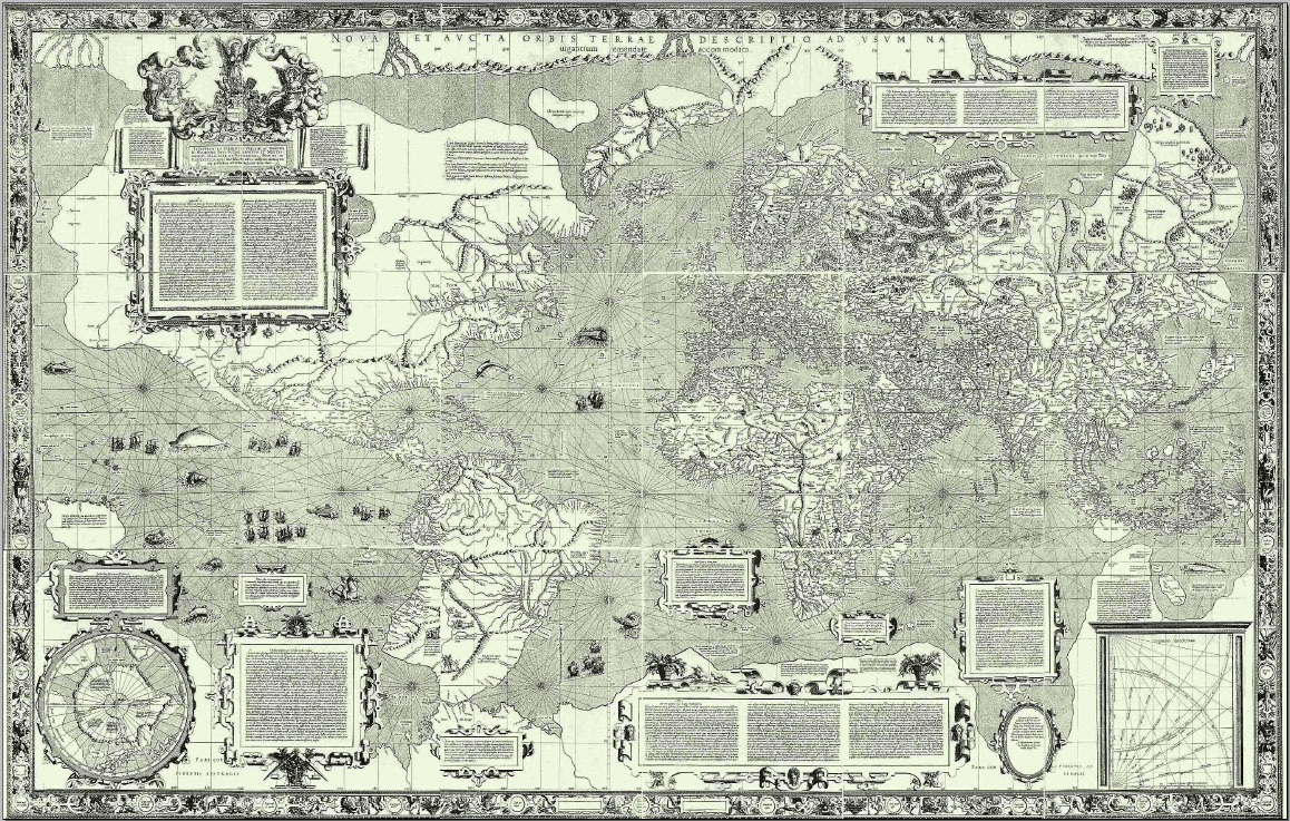
Port to Port is a visual exploration of energy shipping routes around the world. At face value it reads as a beautiful image with neon streams highlighting routes that leave ghostly trails atop a shadowy map. While these lines and colors may be reminiscent of data visualization trends, their attributes—unlike those in many data visualizations—are not arbitrary, and they create a narrative for the dataset. Why build their contemporary map atop the 1569 Mercator Map, for instance? Kurgan explained that the Mercator was originally created for shipping purposes, so it was fitting for her team to use this map as the base for their visualization.

“Mercator 1569“. Licensed under Public Domain via Wikimedia Commons.
It was in these modest details where Kurgan’s interdisciplinary methods became clear. Another project that illustrates this approach through a transmedia narrative is Native Lands: Exits. As part of a larger exhibition (Native Lands: Eject), Exits was an immersive multi-media installation in which viewers were faced with a life-size panoramic video depicting data of human migration.

This project was necessarily collaborative, given the scale and variety of media used. As described in the project overview, “The maps are made from data which has been collected from a variety of sources, geocoded, statistically analyzed, re-processed through multiple programming languages and translated visually.”
Interdisciplinary collaboration is necessary to produce these projects that are historically aware, designed with intention, and where datasets are critically considered. If situated within a practice centered on research, recognizing that maps are political and (as Shannon Mattern succinctly summed) data is not a given, maps and data visualization can move away from empty stylistic trends and homogeny.



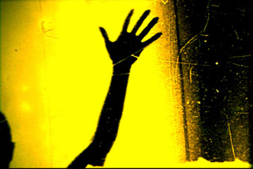
 She opens the film with a blank screen and a buzzing noise, then transitions into a wide shot out a window, where a man hanging on a chair in the adjacent building is doing what looks like some metal work. The next shot is a medium shot where you see the metal worker measuring the wall; she then zooms out to reveal the location of the shot. At one point, the focus goes from the metal worker to the welding tool causing the spark, which looks much like a star. Given Liotta’s fascination with stars, one could claim that maybe on some level she was experimenting with different optics and was trying to find celestial events in human labor on earth. The use of light and shadow, framing and composition—including the framing of some shots with household plants, which created a sense of enclosure — along with a mix of grating machinic sounds and ambient music, created a simultaneously mythic and quotidian feel. Such an feeling is only appropriate for our Hephaestus, the “blacksmith of the gods,” in a mundane airshaft—a myth brought down to earth.


